Details
- Role:
UI Designer / Developer
- Designing:
Sketch, Photoshop, Illustrator
- Prototyping:
Invision
- Coding:
Javascript, React
- Website:
Coldpress is a health food company offering a niche product to health concious individuals. They offer their coldpressed juices both online and in certain retail locations.
The problem.
Coldpress had a problem most companies have when trying to engage customers and sell products. They want to sell more!
"A problem well stated, is a problem half solved." - Charles Kettering
The research team discovered users / potential customers who were unsure what the benefits of coldpressing actually was became anxious and agitated when trying to locate the info on ther site. A seperate user group who actually knew about the benefits of coldpressed juices reacted much differently to the site. Therefore we had some data to get stakeholder buy in to produce some educational assets to relay the companies value. I started mapping out wireframes based around these findings and other discussions about the architecture of the site. As soon as the site loads the user is shown a brief overview of what coldpressing actually is. The call to action is a branded button that allows the customer to view more on the benefits of coldpressing and also about the actual company. This gives the user a choice to read up more on the technical process, but feeds them enough info so they understand what coldpressing actually is and how it can provide them value.
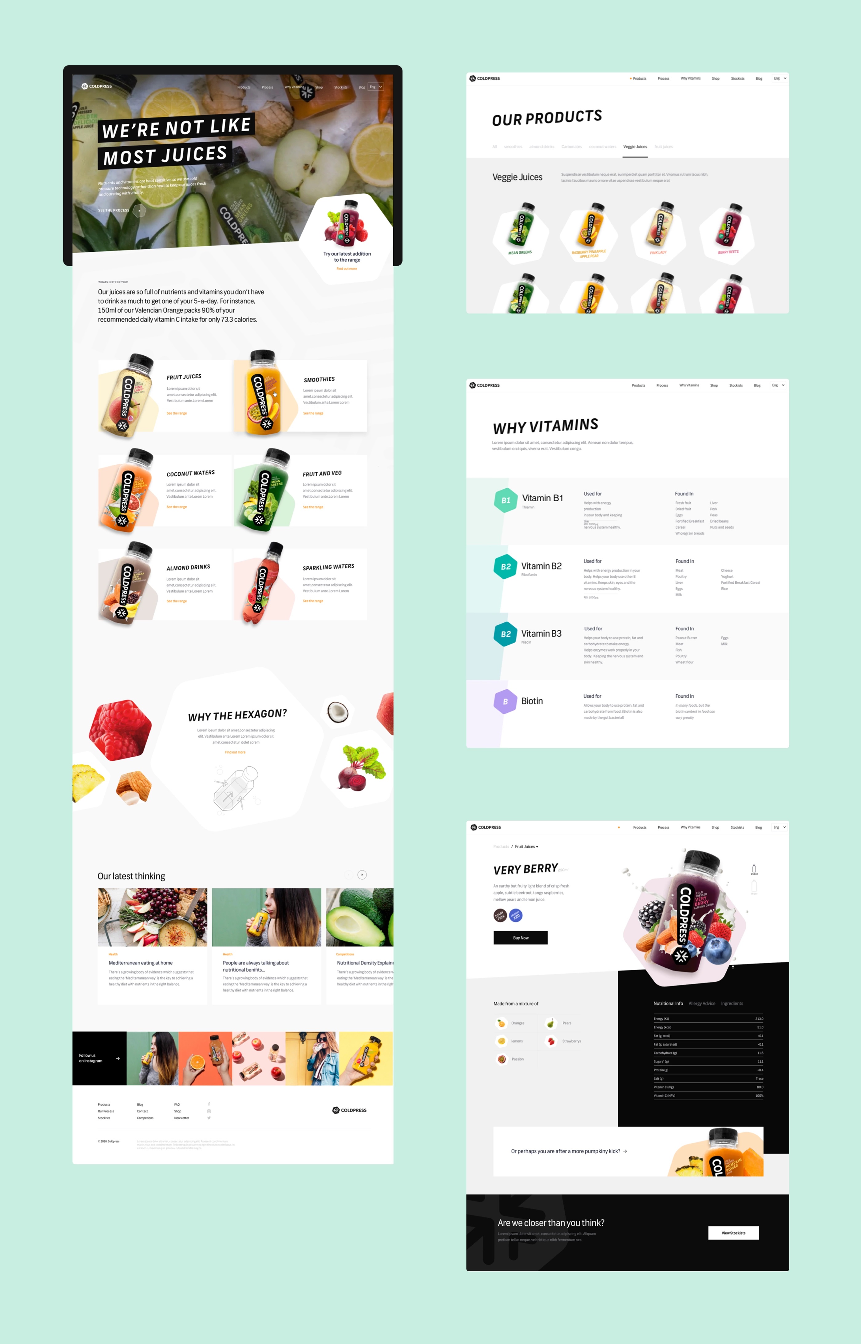
The multi-level communication of the benefits the company offers was also a vital part of design strategy. Imagery, typographic hierarchy, and information architecture go a long way in providing a seamless user experience to relay your message/information.
Checkout the checkout.
Another huge pain point that was identified was the checkout flow. Users were forced to create accounts to checkout. Those who had accounts were never sent emails for cart abandonment, amongst a laundry list of other problems. The design team ran a heuristic analysis on the checkout module and we briefed our findings. One of the biggest problems was error handling, users simply could not recover from a backend payment failure. Upon reducing friction and introducing a more usable flow end-users found themselves checking out in just a few minutes!
Front-End Magic.
Refactoring the front-end with React was smooth. The site wasn't really big enough to warrant using a state management library as components are only nested one to two levels deep. In the event I needed to pass down props to a deeply nested component I could just use React's context API. For SEO benefit SSR was enabled to allow search engine crawlers to properly access the markup. Another added benefit from SSR was a 17% increase in page loading times. Who doesn't want a faster website?
Bring It All Together.
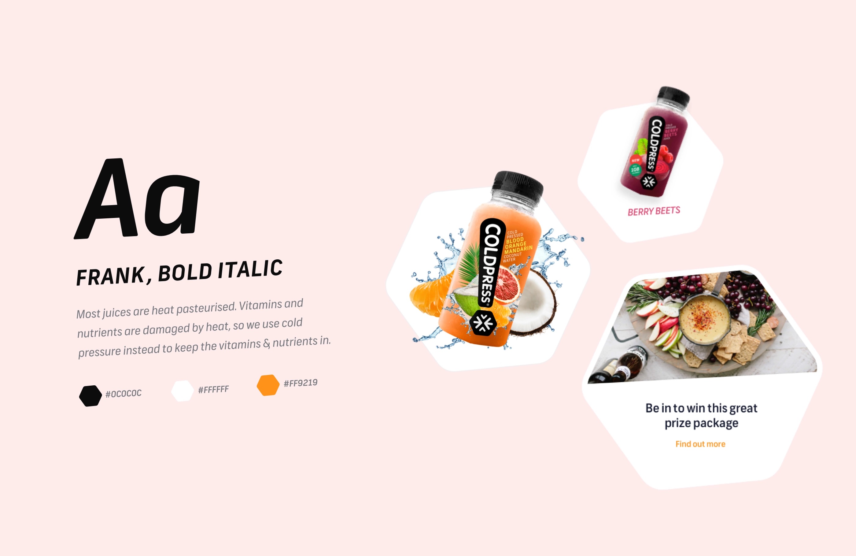
Overall the revitalized branding along with the new bold and playful font connected really well with the colorful imagery the company had already established. The company noticed increased engagment across all social media networks, the biggest increase being instagram. The faster loading times, improved site layout/messaging and improved cart funnel led to an increase of 8% in sales the next quarter!
More Case Studies