Details
- Role:
Lead Designer
- Designing:
Illustrator, Photoshop, Adobe XD
- Prototyping:
Adobe XD
- Coding:
Javascript, React, Next.js
- Awards:
Best Pitch World Blockchain Forum Dubai 2018
- Website:
- Application:
CryptoCurve is a tech company in the blockchain space offering front-end solutions for intuitive interfacing with cryptocurrency. Their main application is currently a web wallet with the goal of consolidating an entire suite of blockchain features into one piece of software. I took on a lot of roles for this project including design and web development.
Branding.
Tasked with coming up with the face of the company, I started doing some research on other companies in the same sector. I found the vast majority to be overly colorful, and also quite playful. To seperate ourselves from the pack I decided to go with black and white for a clean and bold feel. Using the companies initials, I came up with a sleek and well balanced symbol for the logo.
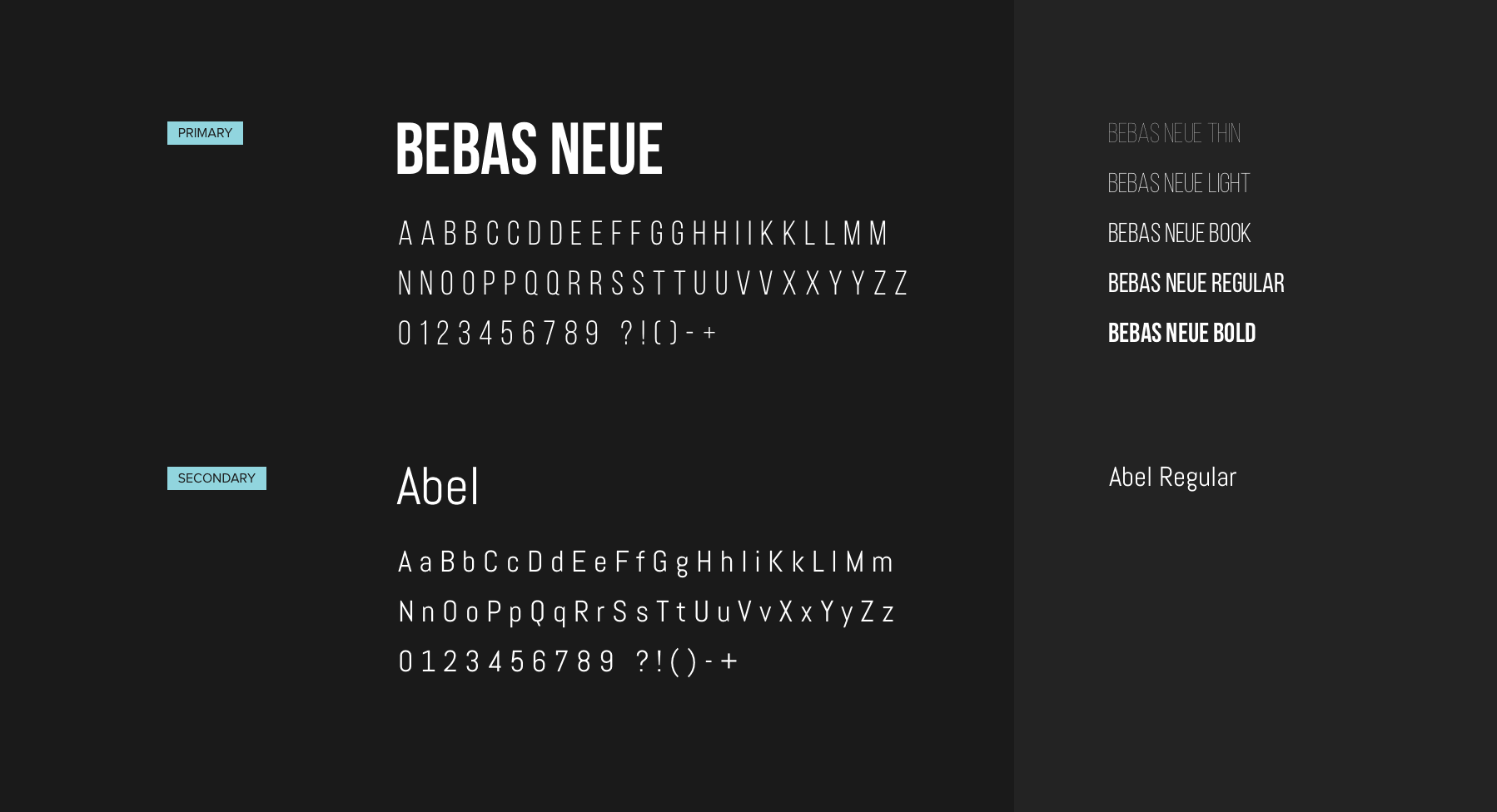
Let there be fonts
The modern and bold structure of Bebas Neue fit stunningly with the logo. Paired with the thinner abel font which is also a sans serif, this encapsulated the exact look and feel I set out to achieve — approachable, modern, and bold.
ffffff
333333
00affa
8fe2f2
1e80f1
1b2138
cccccf
f1004b
Color Exploration
We went ahead and explored colors alongside the mockups of the main website. Eventually we settled on the palette above. The light-blue pops really well on the dark purple. The icy-blue fits as a secondary call to action. The dark-blue works sparingly when you need to capture the users attention. Overall the final color scheme fits the same mission as the font and logo; clean and professional. Below you can see some exploration of different color choices and early mockups of the mobile application.
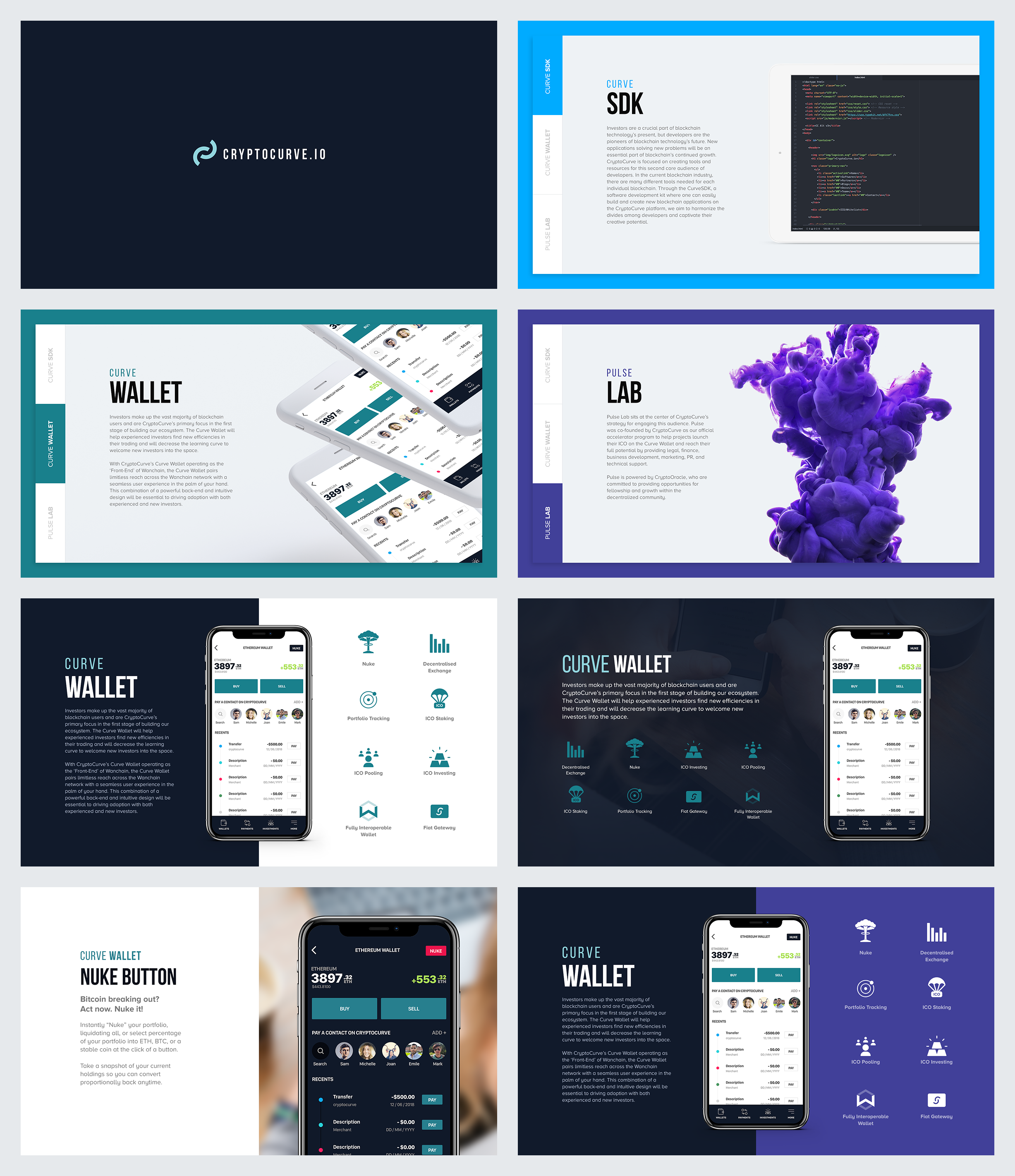
Website.
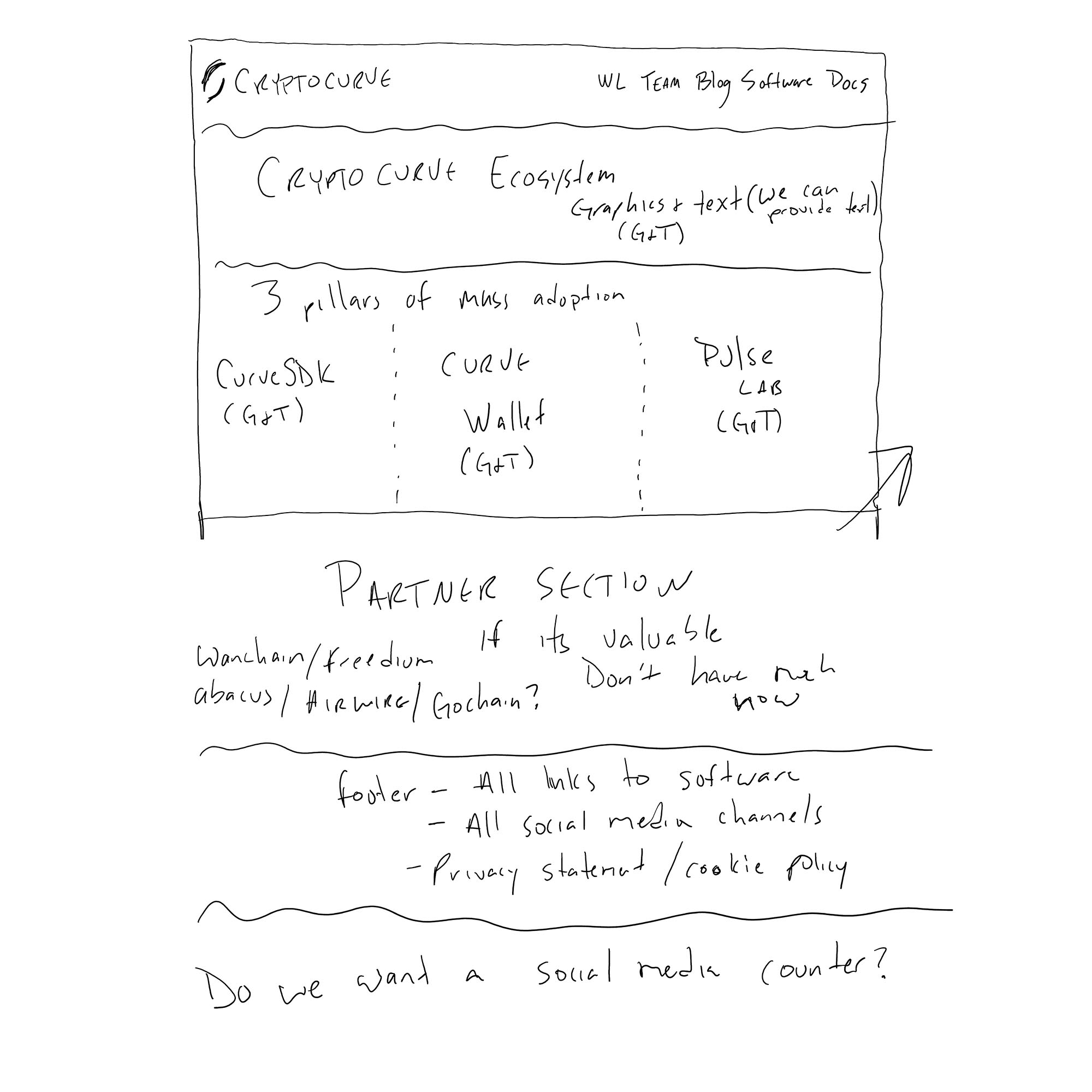
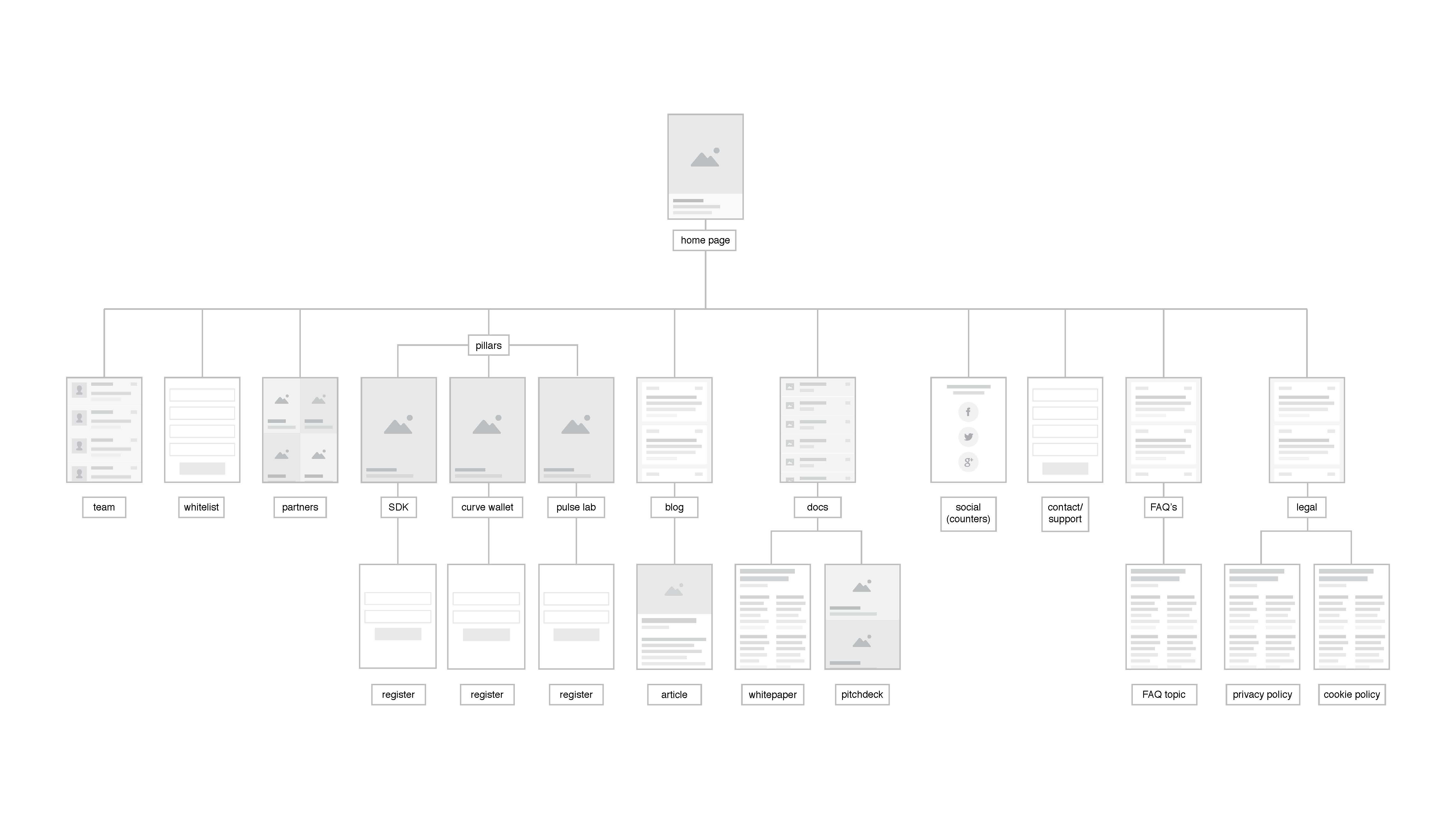
I created multiple iterations of the main brand presence website. The first few were pretty basic static sites with a stack of HTML, CSS, Javascript, and PHP. The last iteration we went with a React and Firebase stack. We had a very tight timeline to get the new site up and running (Agile workflow FTW!). Getting a list of requirements from the stakeholders along with some napkin quality wireframes we got to work.
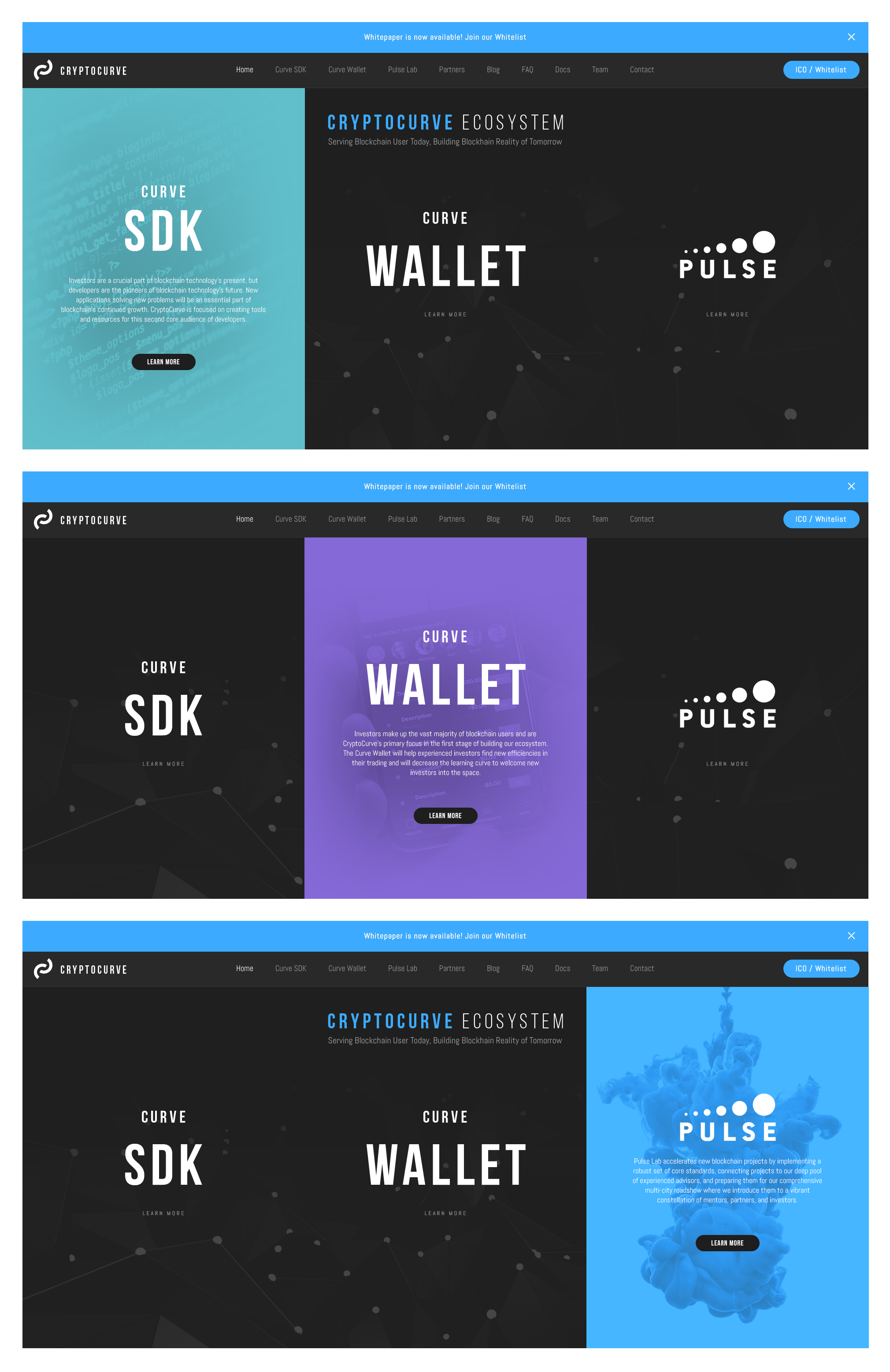
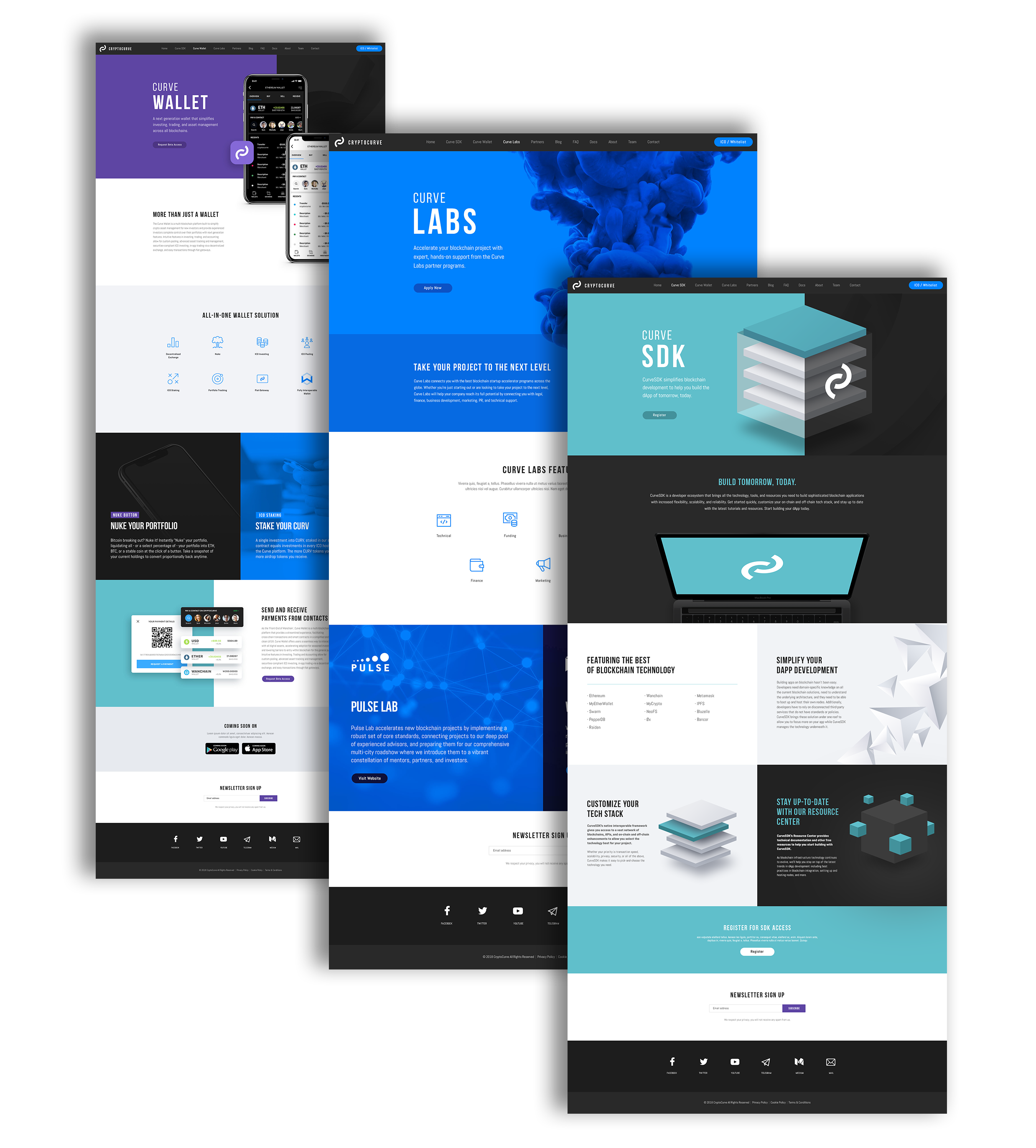
We went straight from the sitemap to high fidelity mockups. At this point the color palette still hadn't been completely agreed upon. The only color that ended up not sticking around would be the purple. The main focus of the site was to give visitors a feel of the overall brand, and showcase the companies main products (the three pillars). On the first site versions the colors were kept black and white with small hints of blue. It was requested we add some color in.
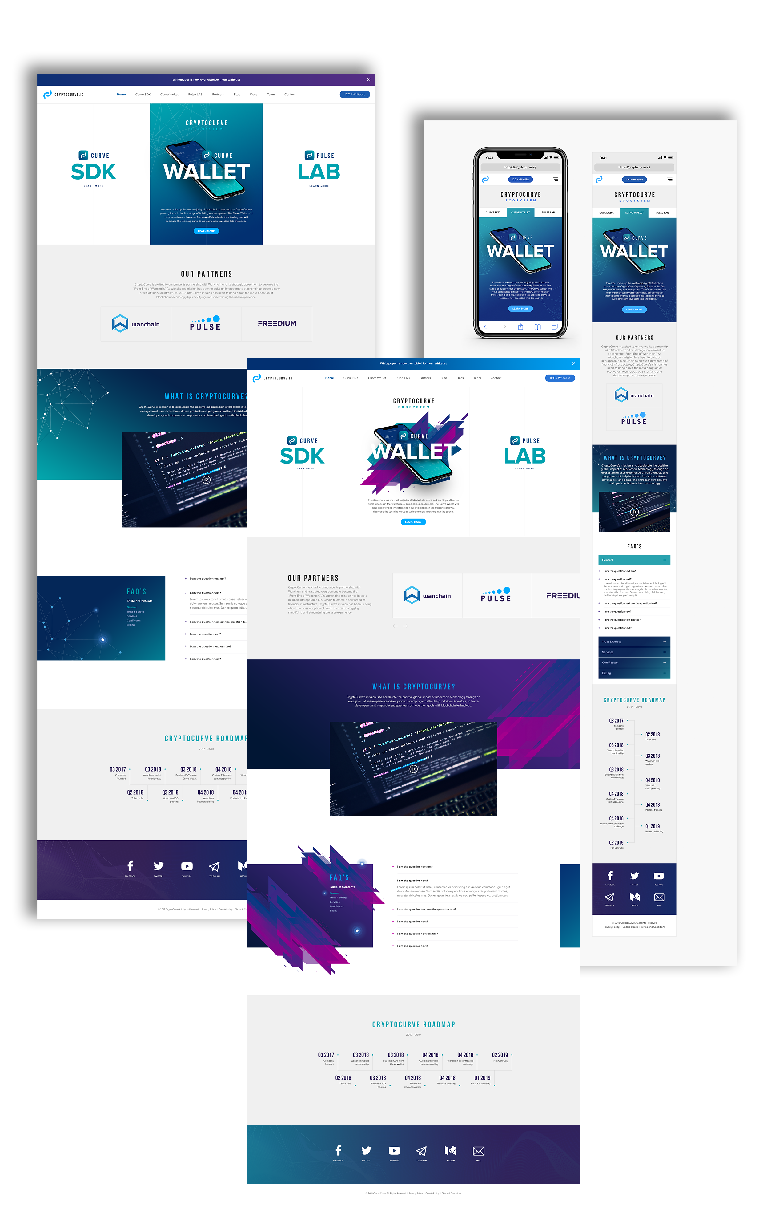
From here we iterated based on stakeholder feedback. A few colors got dropped and we cycled back to the main focus being the bold/sleek vibe everyone loved so much. The layout itself was pretty much a homerun. User feedback was overall very positive. Easy to navigate and not a lot of information overload. The darker layout also made the main call to action stick out nicely. Everything that the company was trying to convey was layed out above the fold. The colors were aligned with each one of the pillars with some slight overlap between them.
Application.
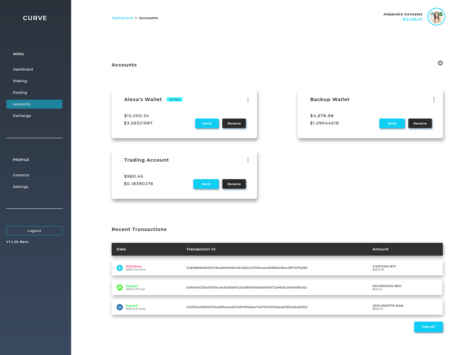
This software application was conceived out of the frustration the average user comes across when trying to use blockchain applications. There are a multitude of apps for achieving different tasks, but not one single app to incorporate all of them. Users need one app for portfolio tracking, another for storing their cryptocurrency. Some people want complete control over their private keys; others want to pool together to buy tokens and they want to be able to trade those tokens right away. This application is split into two front-facing user applications. A web wallet and a mobile wallet (currently in alpha).
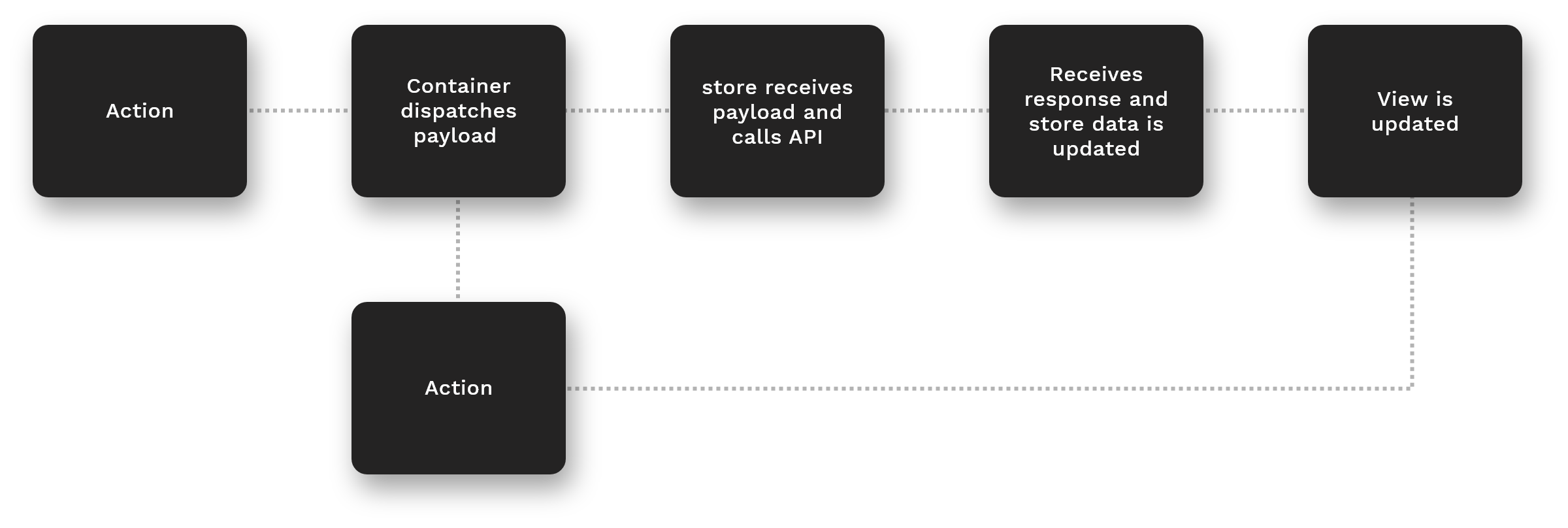
For the client-side we went with an single page React app. The front-end architecture uses a uni-directional data flow structure with flux. Users interact with the view and send events to containers where the business logic occurs. An event is then dispatched with the proper payload to the stores. The stores are where we make the calls to our custom API and store the data. On call completion the store is updated and emits an event. Any container listening for that specific event will receive the update and has access to the data. The data then flows through components using props.
Knowing the scope of the project and after drafting a list of features and requirements, we started brainstorming and mapping out multiple user journeys. After many whiteboarding sessions and paper mockups, we discovered some opportunities and had a good idea of how we would move forward. We split the major features into their own modules and drafted flows/wireframes for each one. Here is an example of my workflow for a major module.
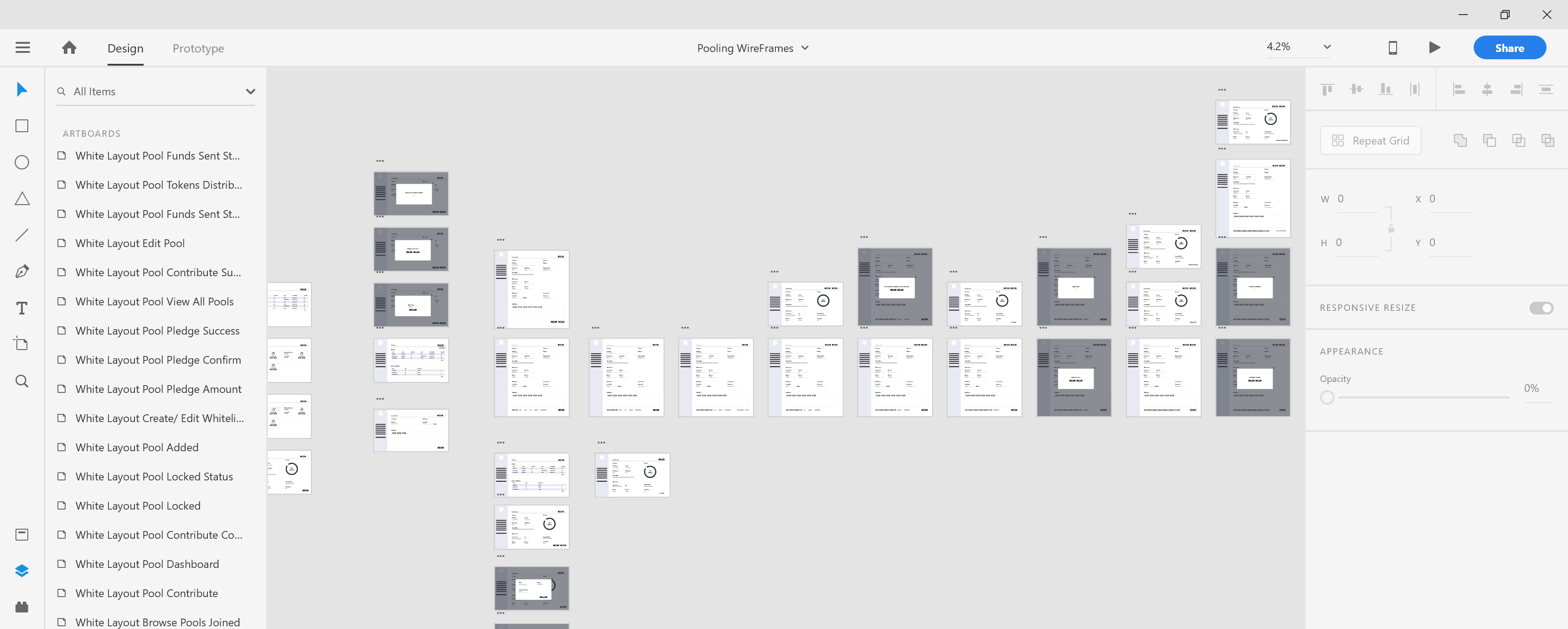
Once the flows and rough prototypes were established I was able to dive into creating high fidelity mockups. This is where the colors were completely finalized and I was able to start putting together a style guide for the application. I also started putting together some rough finalized prototypes based on the flows and styling. You can see some examples below:
Login Prototype | Transact Prototype
Since launching the app we've iterated based off our findings in usability testing and user research to implement new features and improvements. CryptoCurve was one of the first movers in the space to adopt a staking protocol which allowed users to stake their tokens and earn rewards. This key experience was identified through exploratory research and collaboration with the tech team. The UI has received rave reviews and overall the application has been a success. You can try it out here.
More Case Studies